It is not clear which organizations are testing the app for accessibility. I can’t find comprehensive information about the topic or any test results on Github or on the website of the National Center for Cyber Security (NCSC). It is controversial whether people who have not been invited to participate should already install the app. Besides, I live in the USA, so I don’t come into contact with other Swiss people anyway.
Nevertheless, I tested the SwissCovid app. Digital accessibility is important to me, so I regularly blog about accessibility. As a member of the “International Association of Accessibility Professionals”, I want to contribute to an inclusive society with my work.
How accessible is the Swiss tracing app SwissCovid? The great and short answer:
The app is easy to use on iPhone with VoiceOver.
Three aspects came to my attention in my test, which I also reported on the NCSC website.
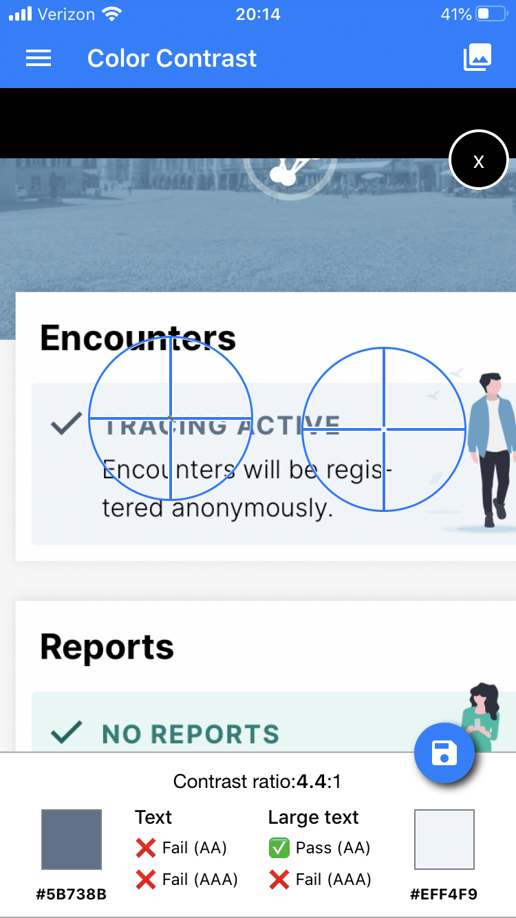
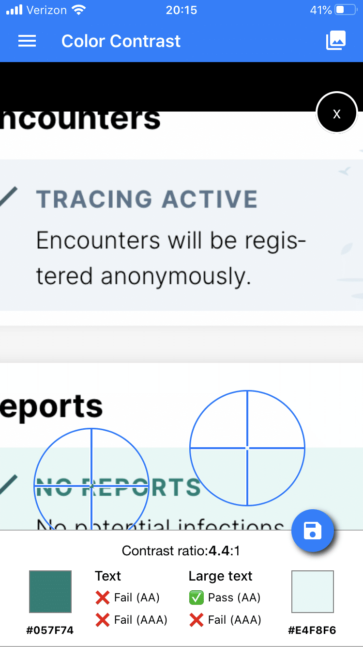
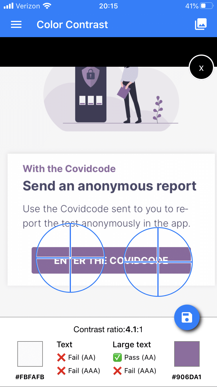
- Insufficient contrasts
- Headings are not marked as such.
- No information that you leave the app and visit a website in the browser by clicking on a link.
Insufficient contrast even in “Increased contrast” mode
On the iPhone, it is possible to enable an increased contrast in the accessibility settings. The developers also point this out on Github.
I think that the contrast between text and background should be sufficient even if this mode is not activated because: You cannot assume that every user knows this option.
I tested both. Once with increased contrast, once without. But even with increased contrast enabled, the contrast ratio between text and background is not sufficient.


Inconsistent labeling of headings
Blind and visually impaired iPhone users operate the smartphone using the integrated screen reader “VoiceOver”. You can also enable VoiceOver in the preferences. You can then use special gestures to navigate the touch screen.
A popular function is to display headings. Similar to navigating a website, iPhone users can “read across” the content and jump from heading to heading without having to have everything read aloud to them.
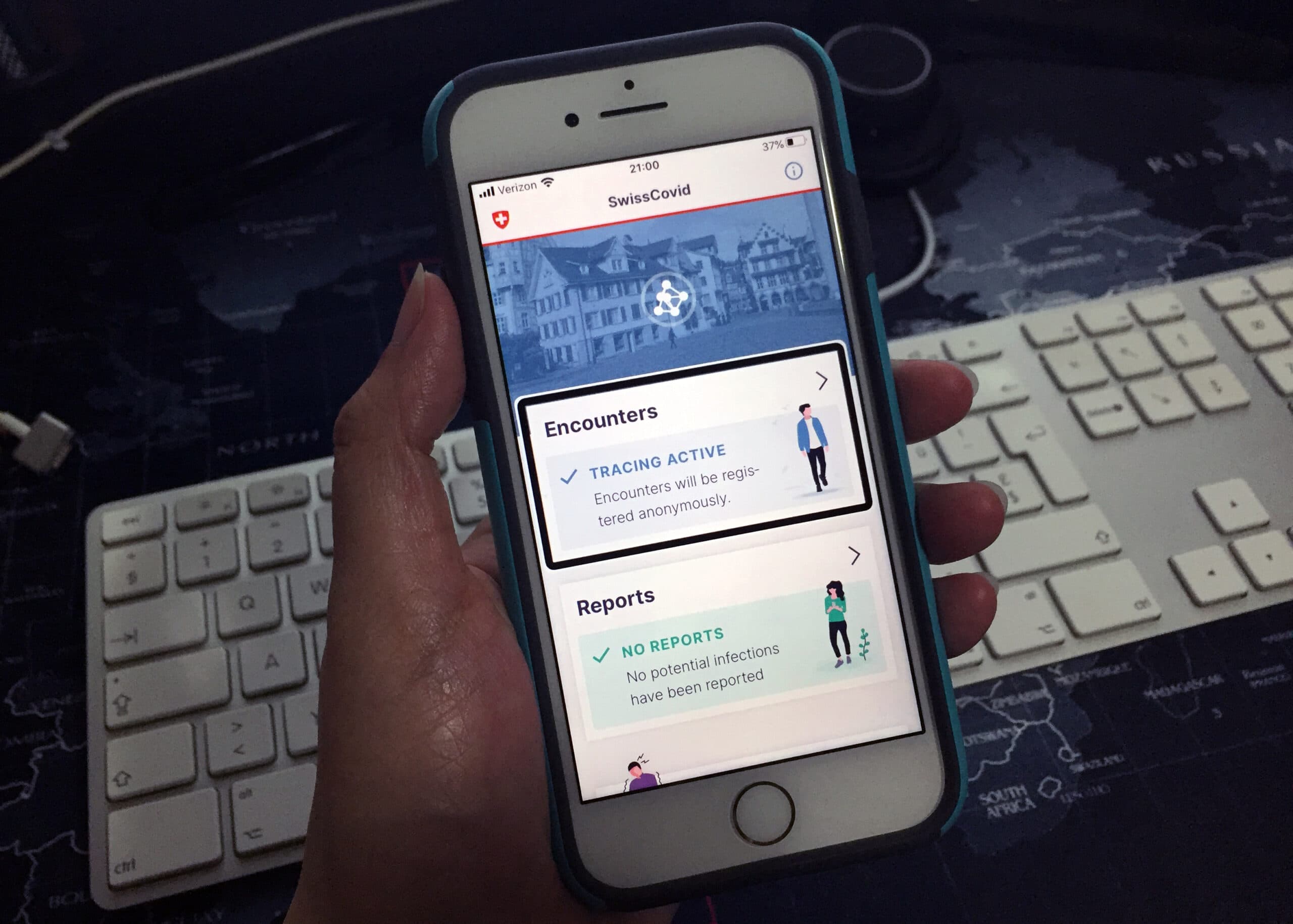
In the SwissCovid app, all headings are correctly marked on the info page. On the other pages, this marking is missing. Sighted people can recognize the headlines by the bold and colored font. For VoiceOver users, everything is presented simply as a section of text.
Inconsistent labelling of external links
According to WCAG 2.1, link texts should inform users at all times about the link destination and functions.
This is done in an exemplary manner with the FAQ button: The link text informs the user that when he clicks, he leaves the SwissCovid app and a window opens in the browser.
For all other links, this information is missing, although there is an icon for sighted people.
Conclusion: The SwissCovid app is accessible, but has flaws
The SwissCovid app is kept simple, visually appealing, and can also be used with VoiceOver. All elements are accessible. It is not a given that the app is straightforward, functional, and accessible. The Austrian app “Stopp Corona”, for example, is not barrier-free. With the New Zealand app, which is available in the AppStore without country restrictions, I first had to register to test “NZ COVID Tracer”. For the tracing to work, you have to scan a QR code at the participating locations.
But although the Swiss app is generally accessible, it would not pass a test strictly according to the success criteria of WCAG 2.1.
The external links and the headings were partially correctly labeled. The developers know how to do this – and there is no rocket science behind it. The small blemishes could, therefore, be corrected with minimal effort, so that the app is not only “basically operable”, but barrier-free according to eCH-Standard 0059.
PS: I am a creature of habit and have been using an iPhone since 2009, which is why I have not tested SwissCovid on an Android device. You use an Android device and have also tested the app? Please tell me about your experience in a comment.

